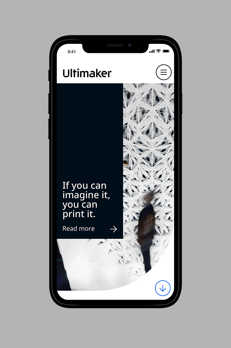
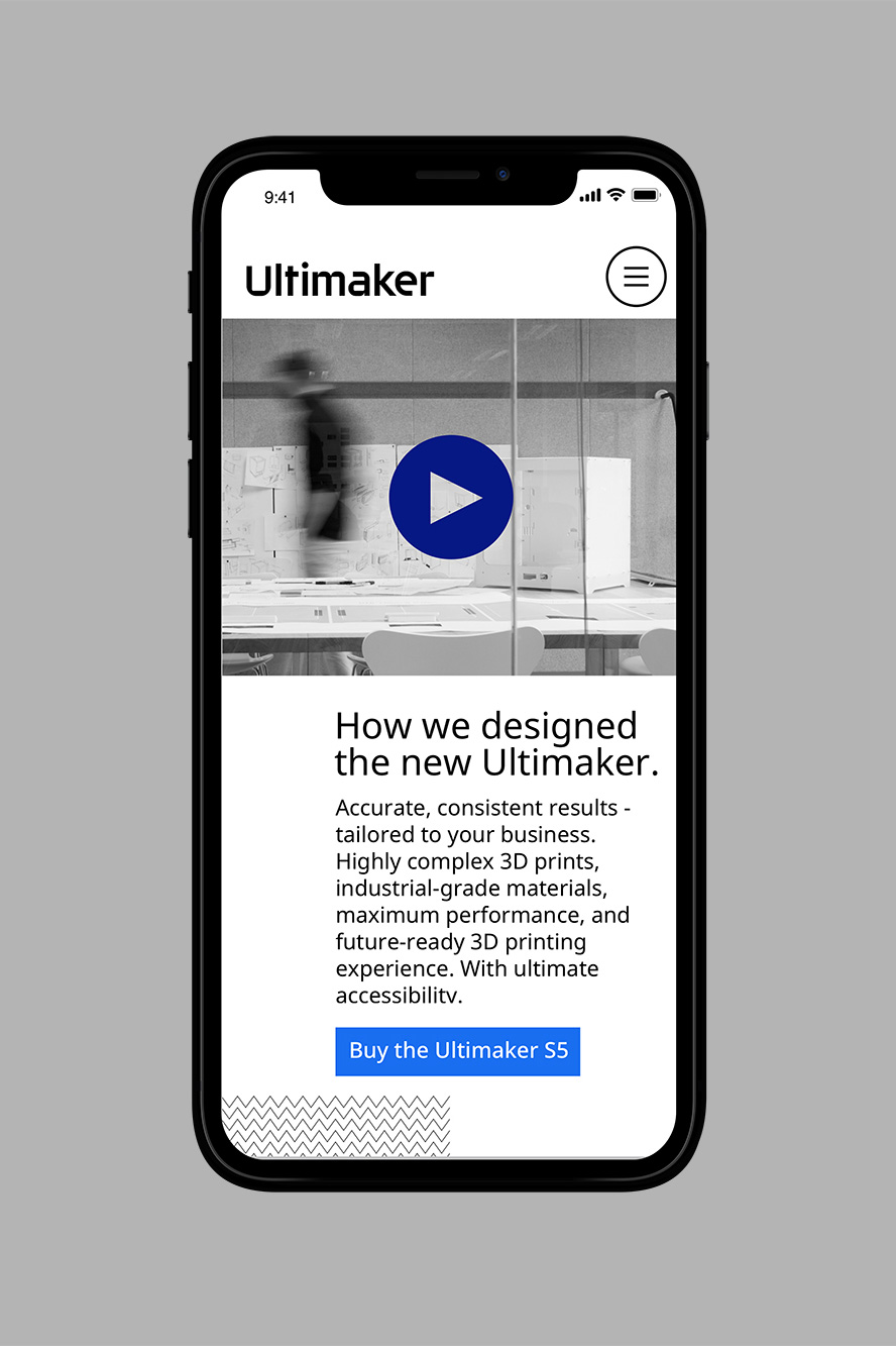
Ultimaker has been a very busy place recently. They have significantly expanded their global market with a new range of printers and products. They have also evolved into a strong and reliable brand for professional use in a very short time. Now, a clear philosophy is needed so that everyday decision-making will clearly communicate their brand, every step of the way.
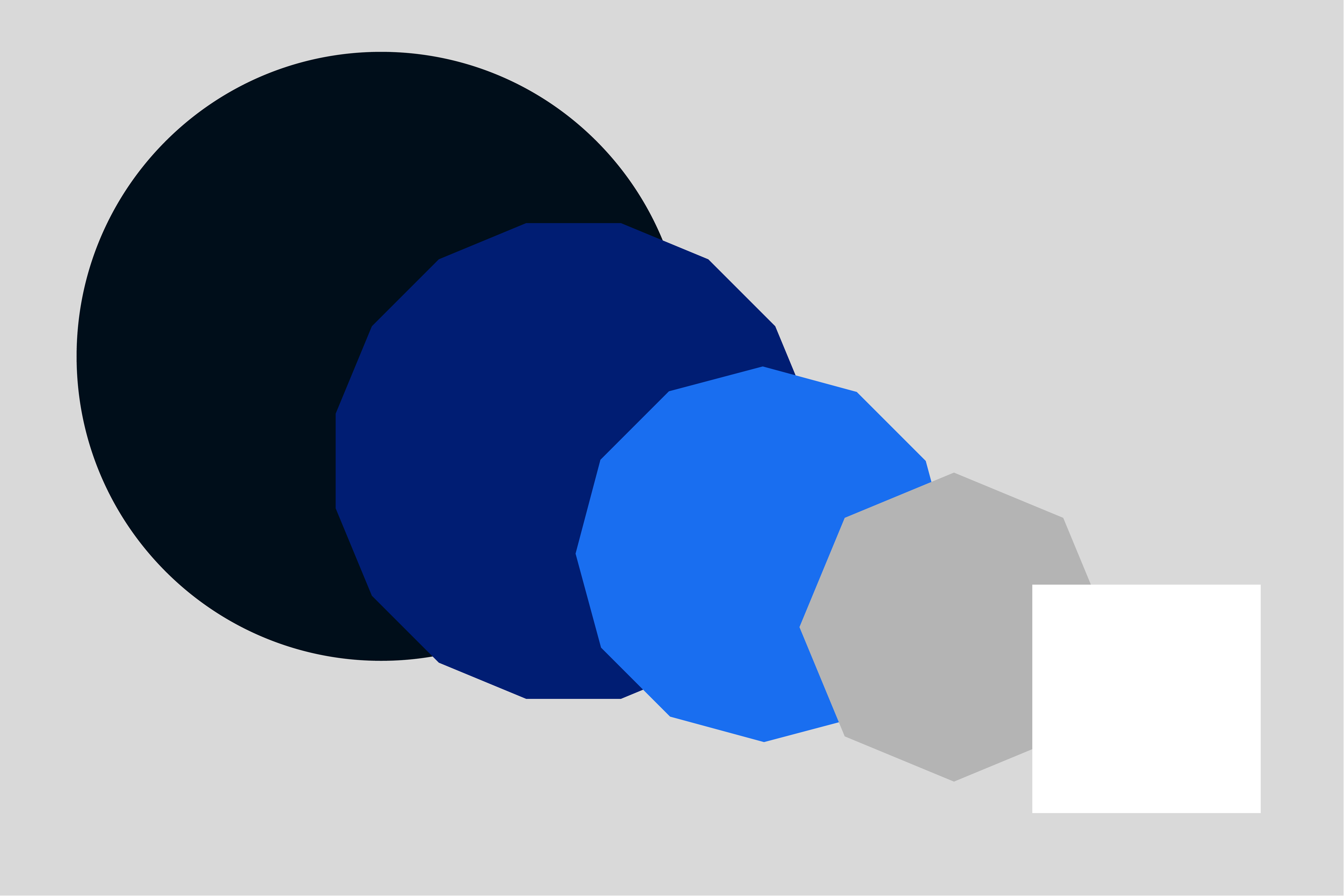
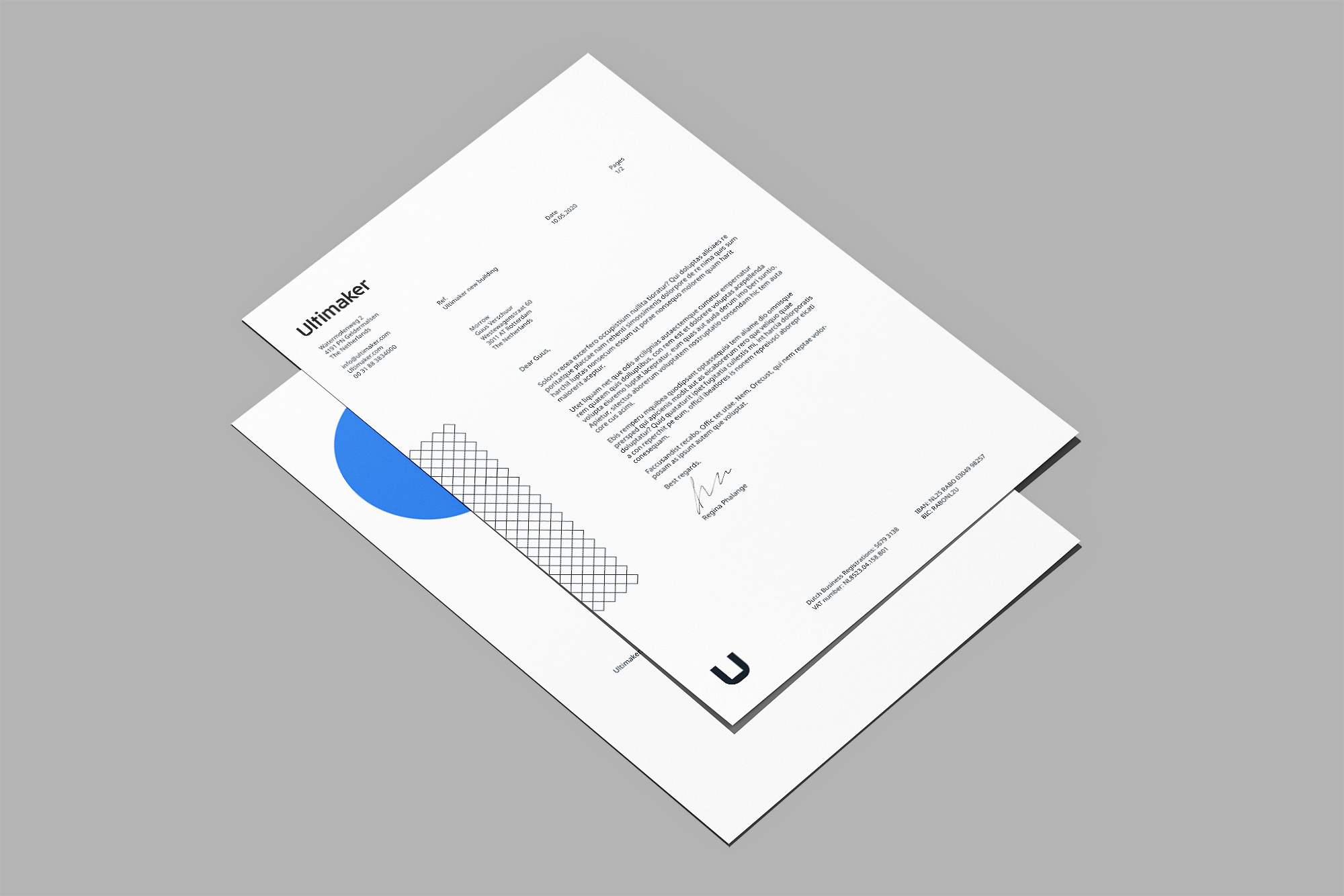
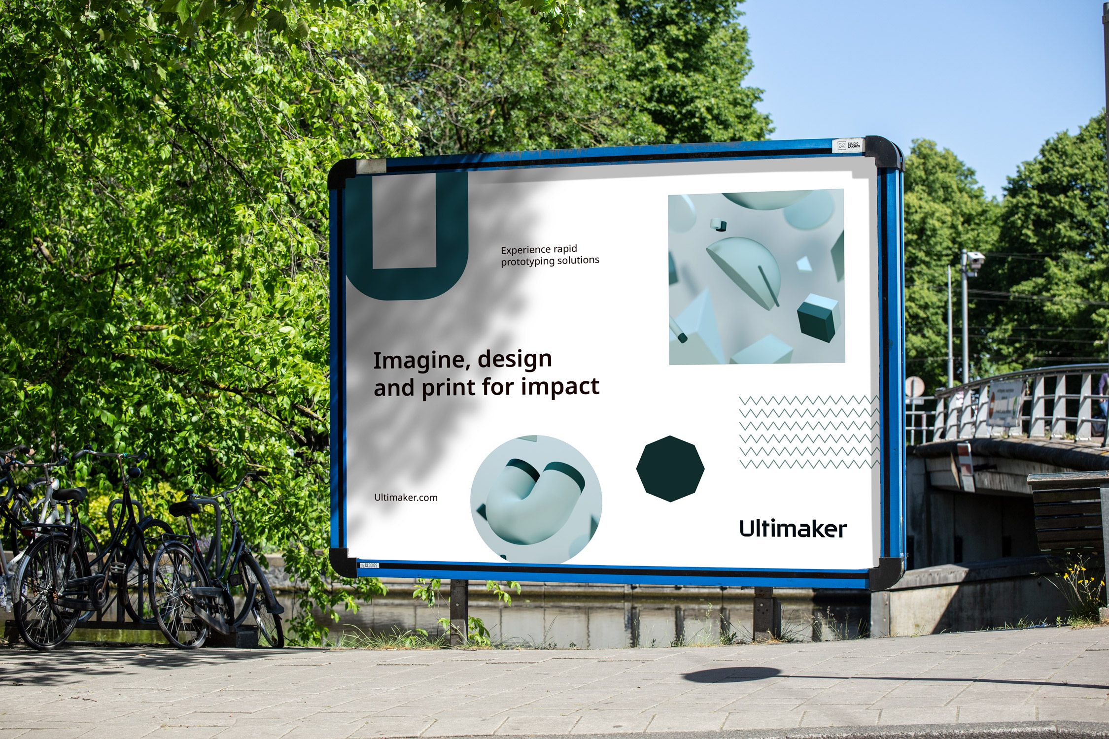
Ultimaker is committed to accelerating the world’s transition to digital distribution and local manufacturing. Whether it’s for fast prototyping, more accurate printing, for use on concrete or on carpet; Ultimaker can be relied upon for excellent quality throughout the entire printing process. If it can be imagined, it can be printed. The starting point of any process is a blank canvas. Over time, an idea evolves from a first draft into a prototype, a product that will eventually lead to perfection. This process is easily translated into that of a square (which, not by accident, resembles an empty build chamber), evolving to a circle; as a metaphor for the seamless printing process. The outcome is a series of process elements that function as a foundation for the word mark and grid system throughout the identity.
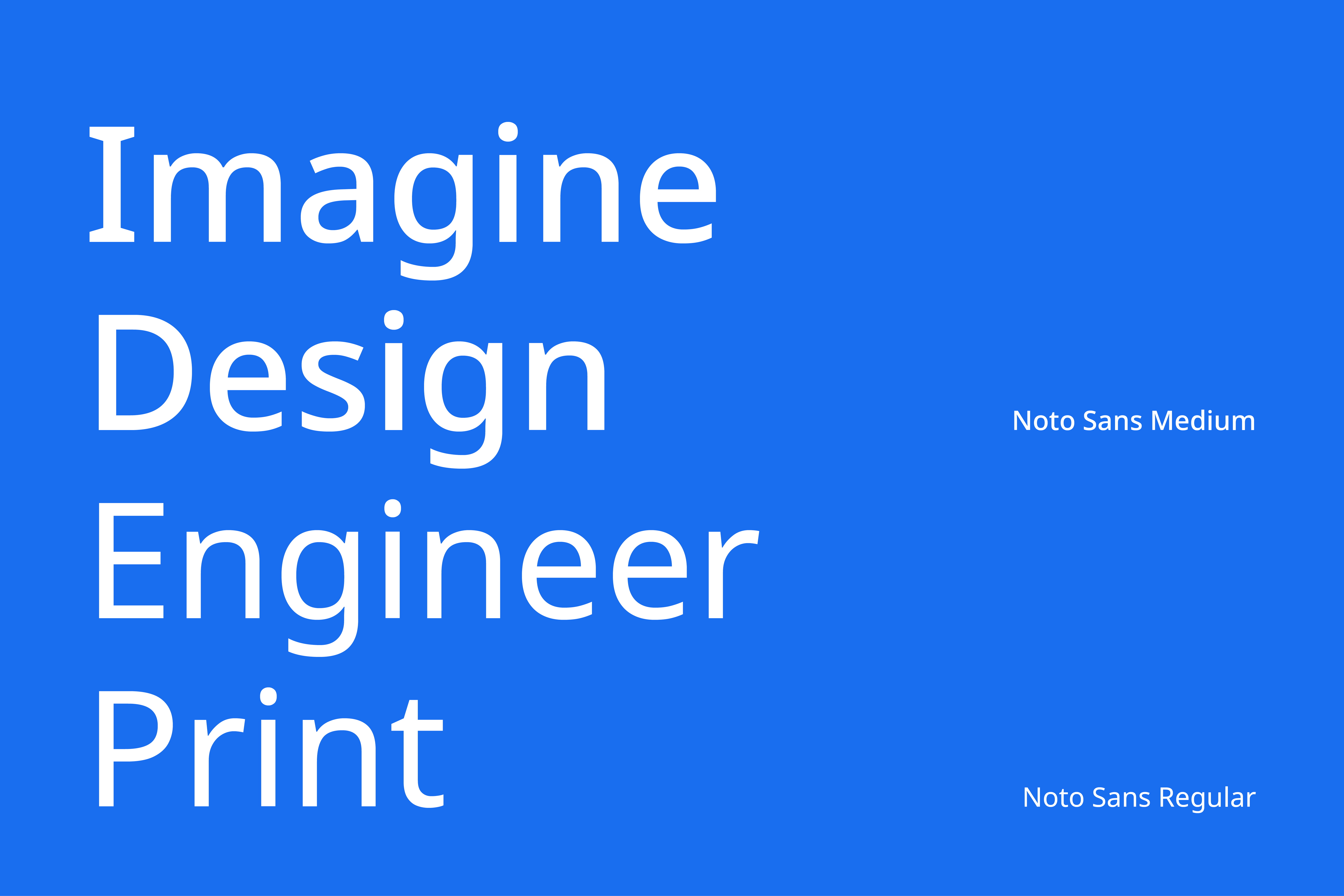
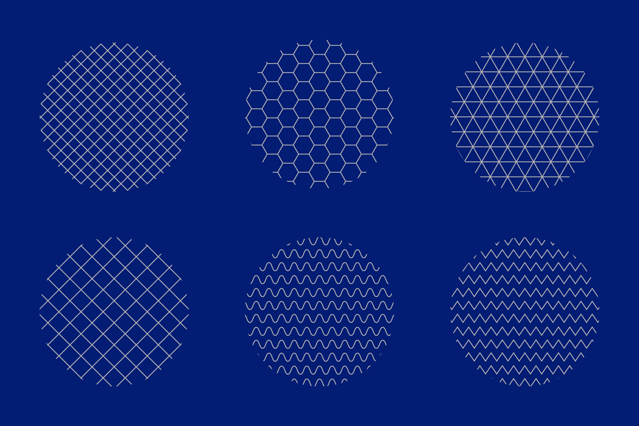
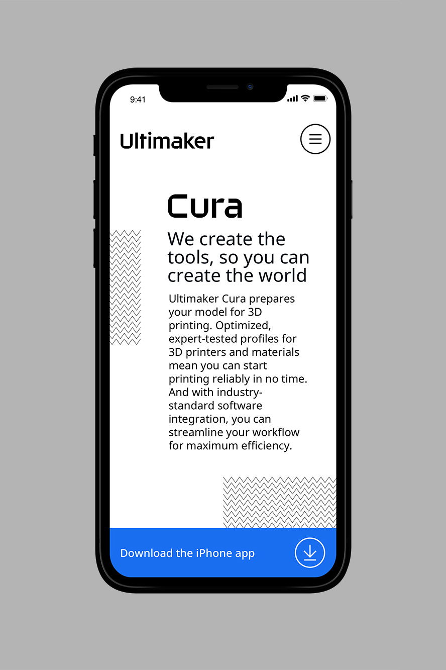
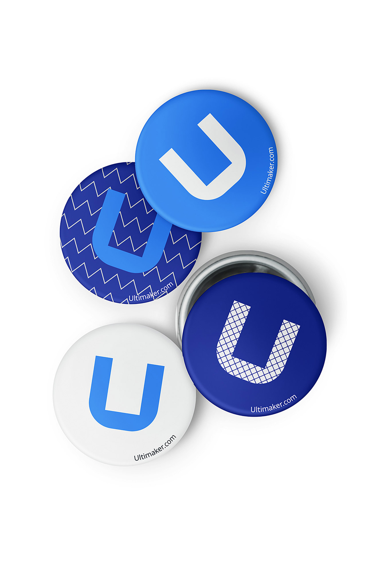
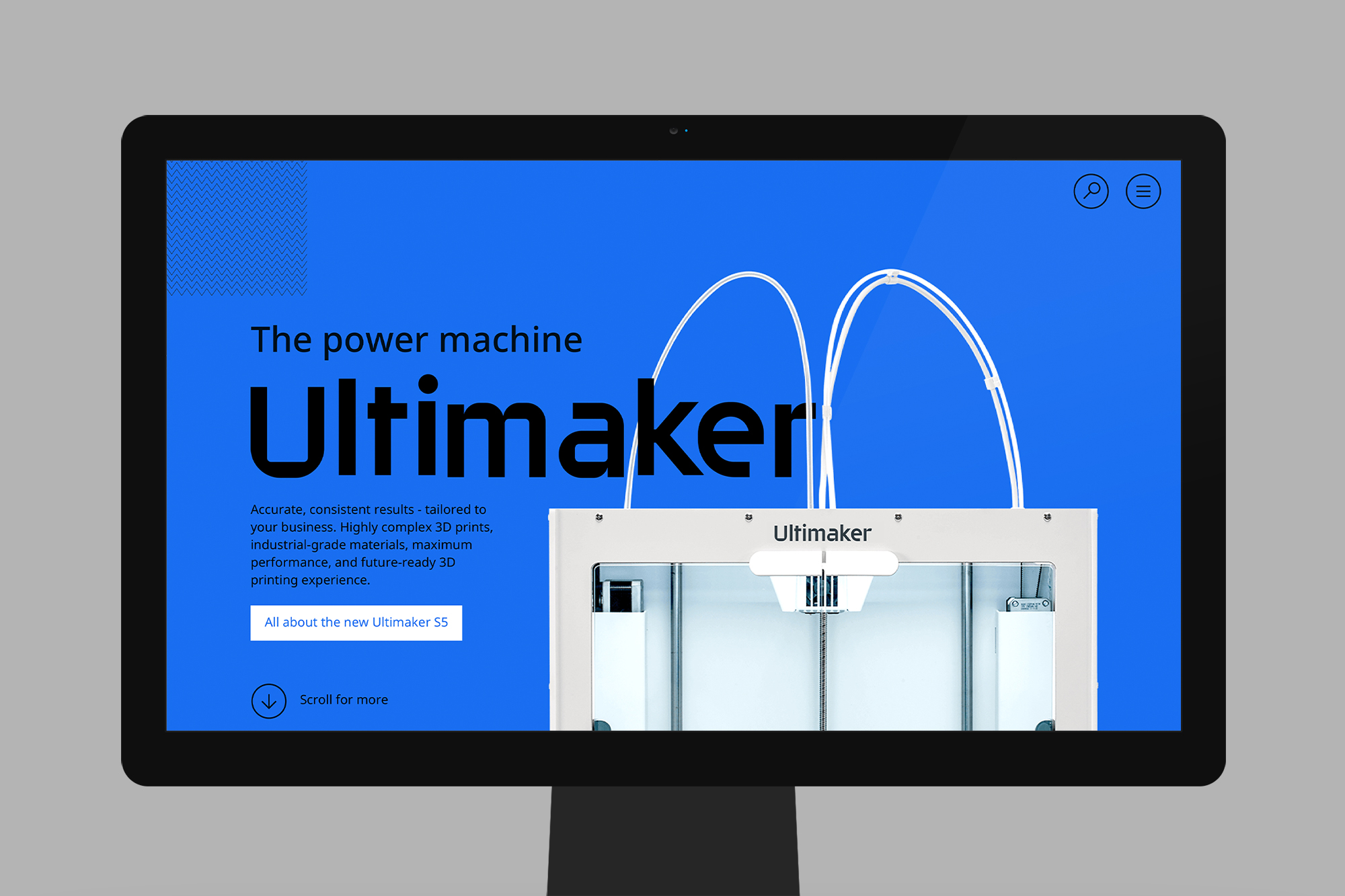
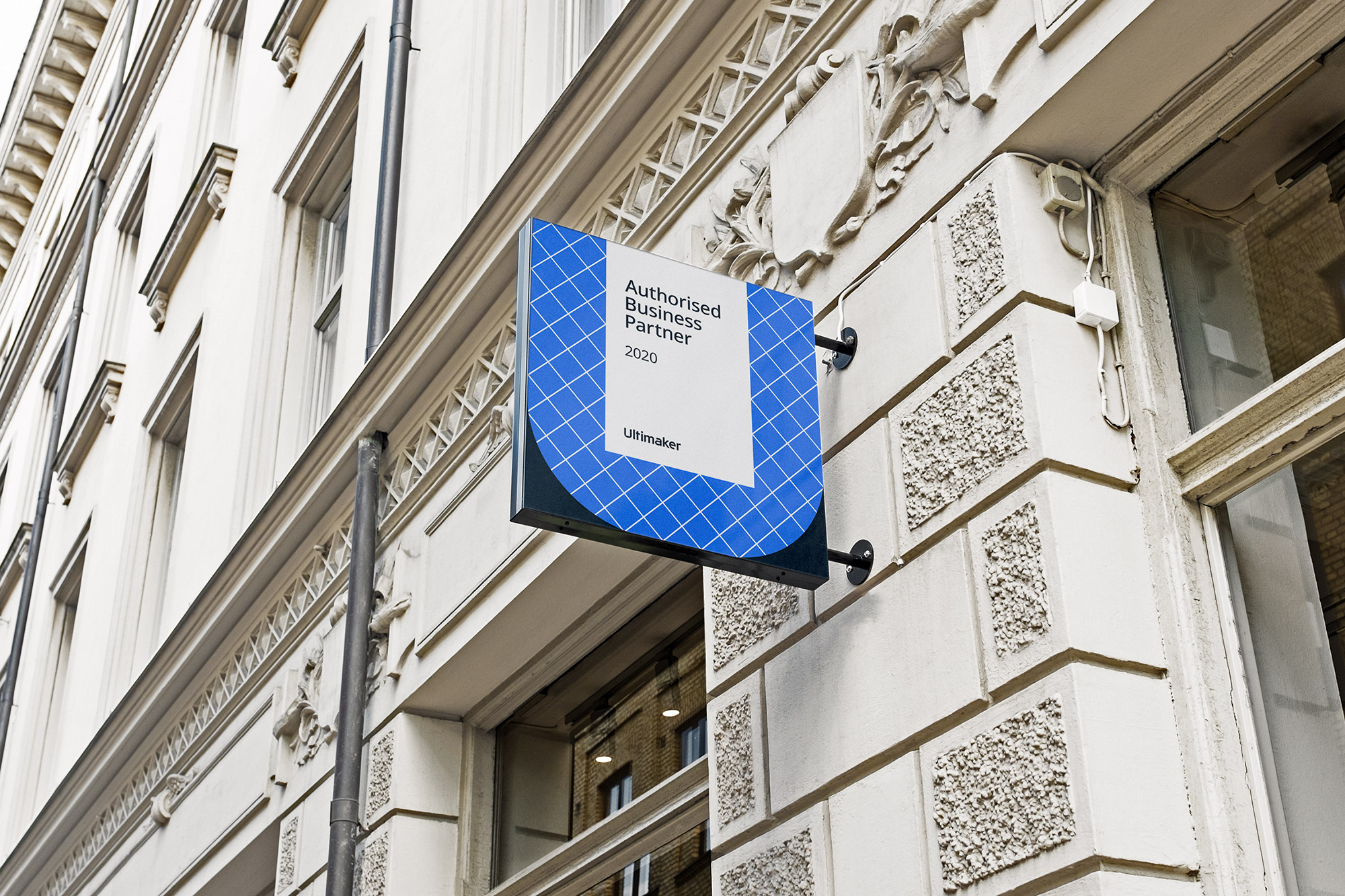
This is complemented with a series of infill patterns which are based on distinct printing techniques. The use of imagery and the supporting colour system celebrate the “creator brand” and form a playful contrast with the typography, which is intended to be visually harmonious across multiple languages, with compatible heights and stroke thicknesses. We created a dynamic identity guided by a pragmatic set of rules that conduct consistency. It is adaptable to the need of appliance and expression for cross-media coverage. The new look also means we had to say goodbye to longtime mascot ‘The Ultibot’. The future-proof identity facilitates clarity and simplicity, the capitalised ‘U’ reflects just that.
Ultimaker is committed to accelerating the world’s transition to digital distribution and local manufacturing. Whether it’s for fast prototyping, more accurate printing, for use on concrete or on carpet; Ultimaker can be relied upon for excellent quality throughout the entire printing process. If it can be imagined, it can be printed. The starting point of any process is a blank canvas.
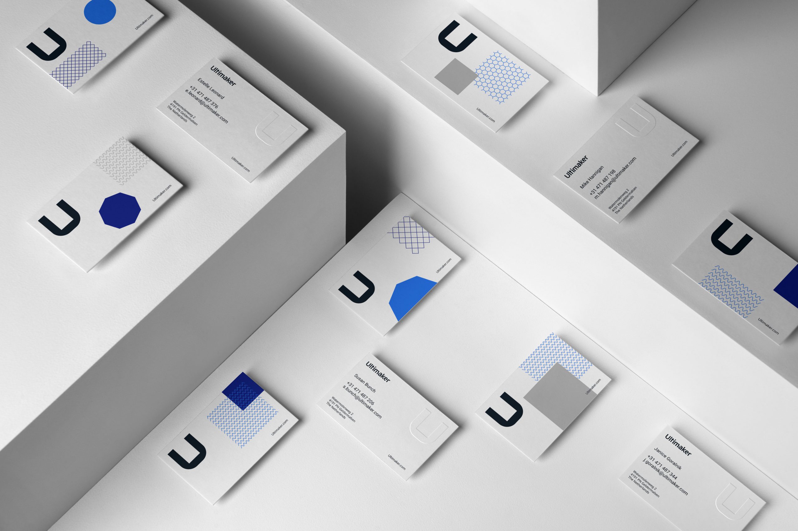
Over time, an idea evolves from a first draft into a prototype, a product that will eventually lead to perfection. This process is easily translated into that of a square (which, not by accident, resembles an empty build chamber), evolving to a circle; as a metaphor for the seamless printing process. The outcome is a series of process elements that function as a foundation for the word mark and grid system throughout the identity.
This is complemented with a series of infill patterns which are based on distinct printing techniques. The use of imagery and the supporting colour system celebrate the “creator brand” and form a playful contrast with the typography, which is intended to be visually harmonious across multiple languages, with compatible heights and stroke thicknesses.
We created a dynamic identity guided by a pragmatic set of rules that conduct consistency. It is adaptable to the need of appliance and expression for cross-media coverage. The new look also means we had to say goodbye to longtime mascot ‘The Ultibot’. The future-proof identity facilitates clarity and simplicity, the capitalised ‘U’ reflects just that.
Client: Ultimaker
Made at: Morrow
Year: 2020
Client: Ultimaker
Courtesy of: Morrow
Year: 2020
Client: Ultimaker
Courtesy of: Morrow
“The new corporate branding is designed with the fullest respect for Ultimaker’s legacy and aimed to further strengthen Ultimaker.”
Jos Burger - Former CEO of Ultimaker
“The new corporate branding is designed with the fullest respect for Ultimaker’s legacy and aimed to further strengthen Ultimaker.”
Jos Burger - Former CEO of Ultimaker
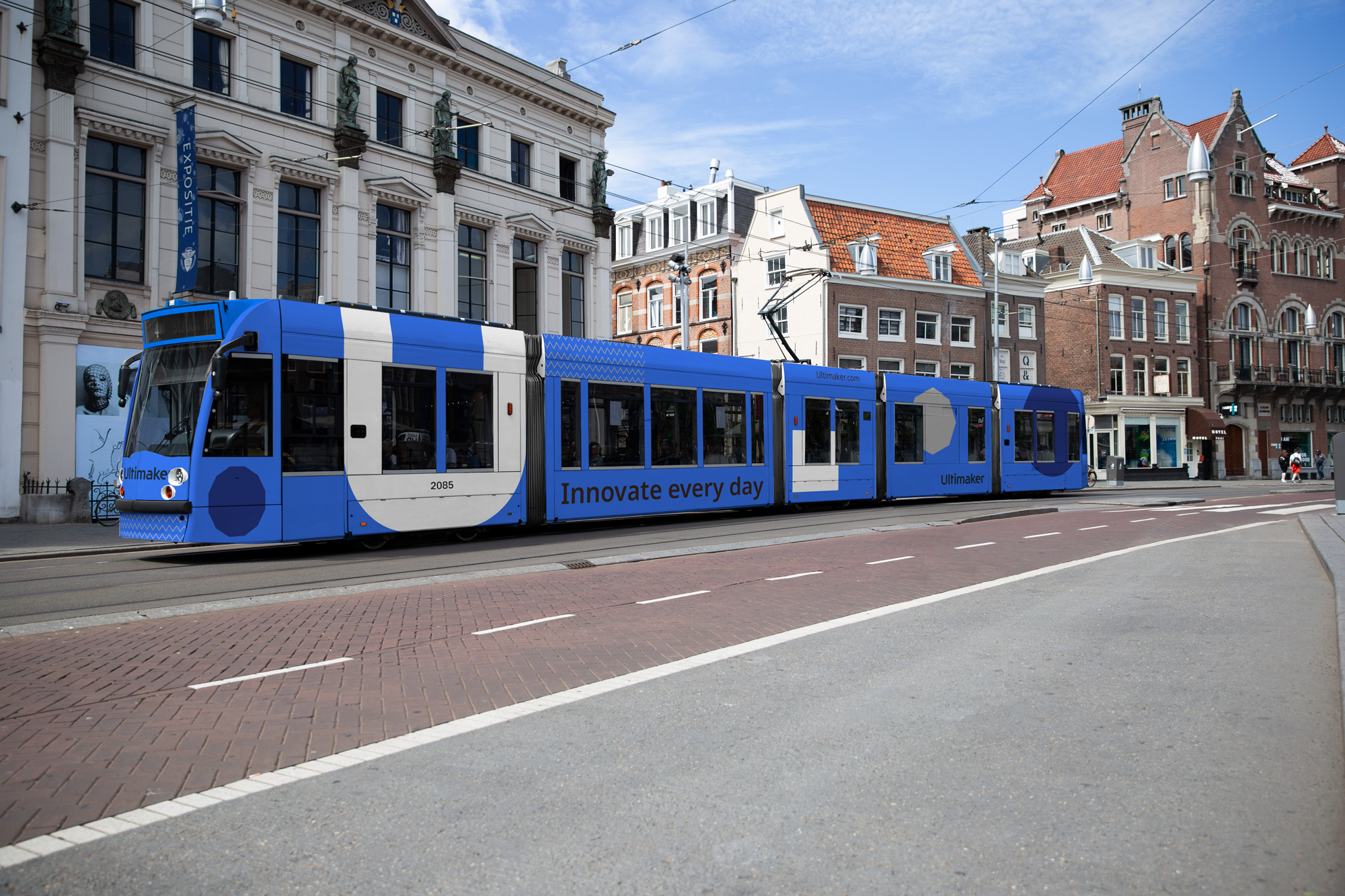
Innovate every day
Behance • LinkedIn • Instagram
